This article, published as part of the Bellingcat Technical Writing Fellowship, is adapted from a more technically-detailed guide on Agnes Cameron’s blog.
Satellite imagery has been used extensively in open-source investigative research: from monitoring global deforestation to documenting mass demolitions in Gaza.
When we view satellite images on platforms like Google Earth, the world looks very similar to how it does with the naked eye – for example, if you were looking down at the earth from an aeroplane window.
However, satellite images can also reveal things that humans can’t see. A common example of this kind of imaging is night vision, which uses infrared light to illuminate a scene that’s not visible to the naked eye. In satellite imaging, images made using additional types of light are known as multispectral images.
Multispectral satellite images can reveal useful information about the world, such as the presence and quality of water, types of vegetation, soil health and more. In this guide, we will explain the basics of how multispectral satellite imaging works, apply it to case studies relating to mining and deforestation, and review open-source tools and resources for using these techniques in practice.
Ways Of Seeing
When we look at an object, what we are really seeing is the different colours of light that are reflected by that object. When we look at plants, they appear green because the chlorophyll in their leaves absorbs blue and red light, and reflects green light. In autumn, leaves turn orange because the chlorophyll starts to break down to conserve energy, and they start to reflect red light too.
An image that reflects how the human eye naturally sees things is known as a “true colour image”, consisting of three bands (or ranges) of visible light – red, green and blue – that can combine to make up any colour. If an object reflects all visible light we see it as white. Conversely, if it absorbs all visible light, it appears black.
See how this works by toggling the red, green and blue channels in the image below on and off:
Multispectral images can be useful in investigations as they can highlight changes to the Earth’s surface that wouldn’t be visible to the naked eye, whether due to mining operations, deforestation, or pollution. Most commonly, these images use bands of light from the infrared part of the light spectrum, in addition to those typically visible to the human eye.
We can look for signs of different activities by comparing different bands of light (visible and invisible), highlighting contrasts that we normally wouldn’t be able to see.
In the example below, a river is barely visible in the image on the left, captured with a digital camera, due to hazy conditions. But it is clearly visible in the image on the right, captured using infrared light. This is because the longer waves of the infrared part of the spectrum are less likely to be scattered by small particles, such as the water droplets in fog or pieces of dust, than visible light.
Another common use case of infrared light is to highlight vegetation, as healthy trees and plants reflect a lot of infrared light in comparison to other materials.
Since we cannot typically see infrared light, we have to map the data on the light captured from these bands to visible ones – red, green and blue – in order to detect different types of materials. There are three main ways to do this, which we will cover in this guide.
1. Using Band Combinations to Create False Colour Composites
Just as visible light may be separated into red, green and blue bands, the infrared light that satellites can capture can also be broken down into distinct bands, each representing a range of wavelengths that are useful for analysis. Commonly studied infrared bands include Near Infrared (NIR), Shortwave Infrared (SWIR 1 and SWIR 2) and Thermal Infrared (TIR).
The simplest way to visualise these invisible bands of light is to directly map them to a visible colour channel (red, green or blue) to create a “false colour” image. This mapping can highlight differences between materials that might look very similar under visible light, or, as in the example above, allow us to see more clearly in adverse conditions.
There are several free and open-source satellite imaging tools that include features allowing users to create false colour composites using different band combinations, such as EO Browser, Google Earth Engine and QGIS. To demonstrate the techniques used in this article, we also built a tool called the Multispectral Imagery Explorer that uses Google Earth Engine to show what false colour images using several band combinations, band ratios and band indices (which will be covered later in this guide) may look like.
The case study below uses images from the Multispectral Imagery Explorer to demonstrate how band combinations can highlight specific materials.
Case Study: Finding Clay Mines in Sandersville, Georgia, USA
Kaolin clay (also known as kaolinite) is a naturally occurring mineral that is used in many industries, most notably the production of paper and ceramics. Like any kind of mining, extracting this material can result in environmental impacts such as the destruction of habitats and the contamination of nearby water bodies with mining waste products.
Satellite imagery analysis can help researchers monitor areas with high deposits of kaolin clay, where mining activities may be taking place.
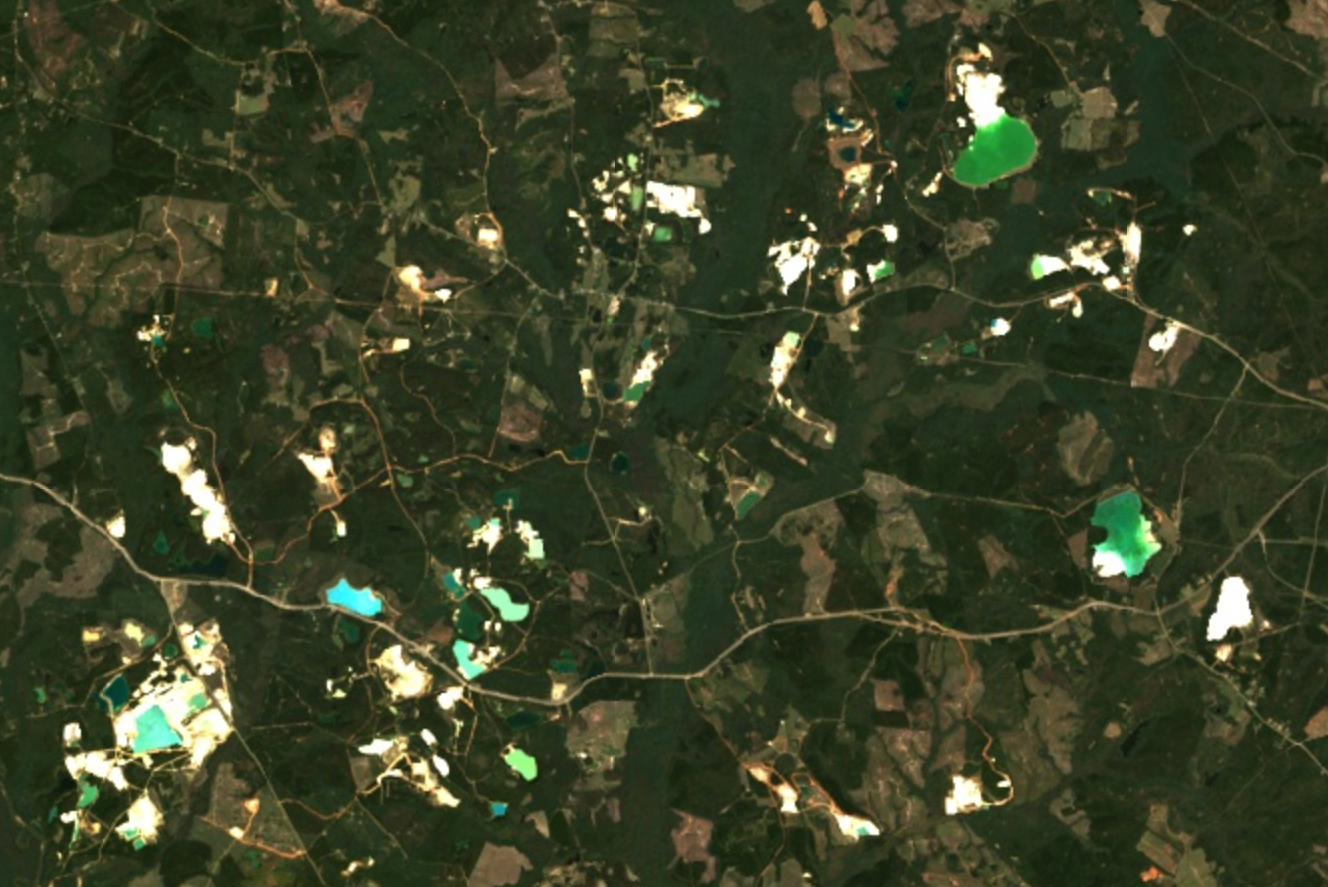
The below true colour satellite image shows mining pits and lakes high in kaolin clay deposits in the town of Sandersville in Georgia, USA, which is known as the “Kaolin Capital of the World”. More than 8 million metric tons of kaolin clay, worth an estimated US$1 billion, are extracted from large open pit mines in Georgia state each year.
The lakes are visible as spots of green in this image, but it is difficult to tell where we should look to find mining operations. Although kaolinite is white in colour, it cannot be distinguished from other white materials in a true colour image because these often have similar reflectance properties under visible light.
To help us highlight differences in these areas, we will examine the reflectance spectrum of kaolinite, which shows how the material reflects light across both visible and infrared wavelengths.
We compare them with the reflectance spectra of eight different bands of light captured by Landsat 8, a satellite launched by NASA in 2013 which is still in orbit and collecting one of the world’s longest-running satellite imagery datasets. While multispectral images captured by other satellites, such as Landsat 9 and Landsat 7 (which ceased operation earlier this year), record data on similar bands of light, we will be using the Landsat 8 bands for all the examples in this article.
The black line below represents the reflectance spectrum of kaolinite, while the vertical bars show the wavelengths of the Landsat 8 bands.
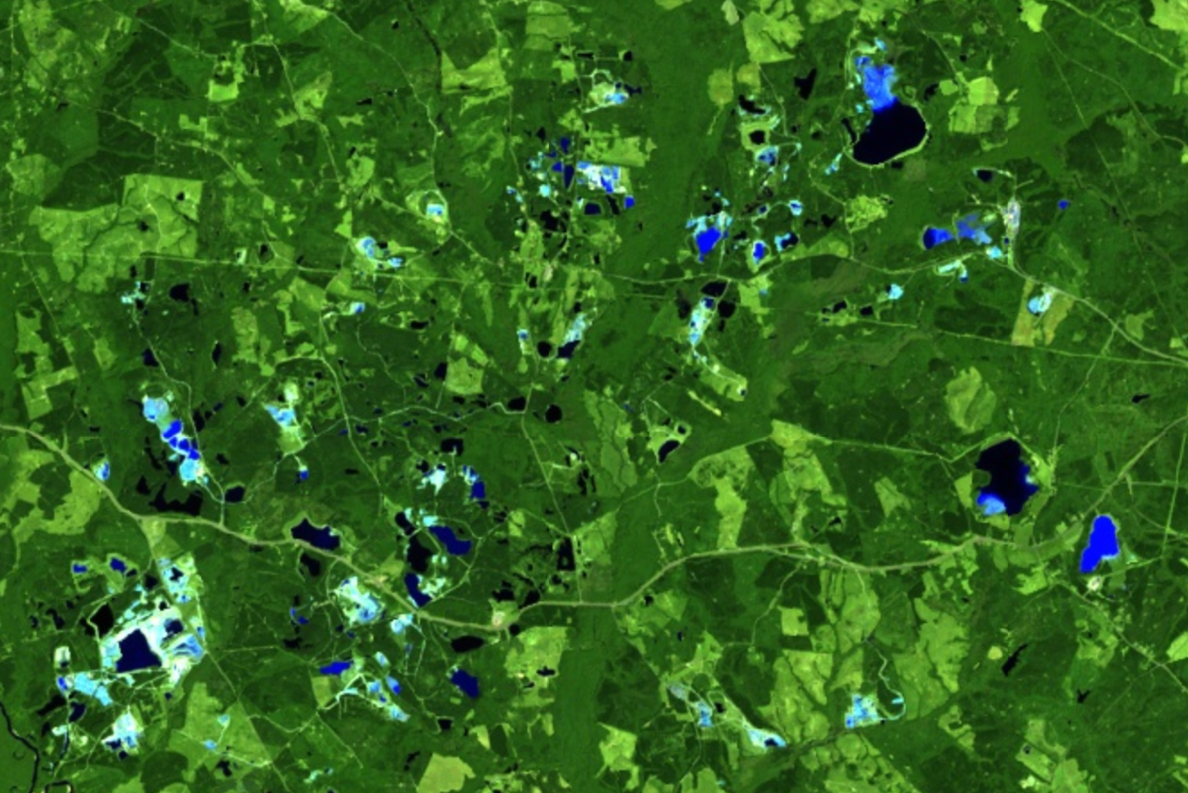
To help us spot possible kaolin clay, we can use the bands in which the material reflects a high amount of light, alongside those in which it mostly absorbs light, to create a false colour composite. The different bands are mapped to visible colours in our false colour image as follows:
- SWIR 2 band (7) → Red
- SWIR 1 band (6) → Green
- Red band (4) → Blue
This means that if the material shown in the image reflects a high amount of light in the SWIR 2 band, it would show up as red pixels in the false colour image, light in the SWIR 1 band shows up as green pixels, and light in the red band shows up as blue pixels.
Since kaolinite reflects more light in bands 4 and 6, and less light in band 7, areas with a concentration of kaolin clay should appear cyan, a combination of the colours they are mapped to – green and blue respectively. Compared to the above RGB image, it’s now possible to see much clearer delineations between parts of the image that appear blended above to identify possible kaolinite mines – although these still need to be confirmed with other sources, since other materials may have similar reflectance properties.
2. Band Ratios
Band combinations are useful if the material we are looking for can be observed with comparisons of up to three bands (one band per colour channel). However, these may not be as precise as we wish because band combinations may be affected by variations in shadows and light, atmospheric conditions such as haze or materials with overlapping reflectance properties – an area that looks cyan may actually reflect an area that contains materials that reflect a lot of light separately in the blue and green channels, for example. By combining different bands together using a band ratio, we can build even more powerful visualisations to differentiate features of interest.
Band ratios highlight the contrast between different bands by dividing the values of pixels in one band by those in another. When determining which ratio to use to highlight a given material, we look for the parts of the light spectrum where the material reflects the most and least light. By dividing one by the other, it’s possible to pinpoint very specific materials.
Bellingcat contributor Ollie Ballinger has a comprehensive guide to using Google Earth Engine for satellite imagery, which could be useful if you would like to explore these techniques further. The code for the Multispectral Imagery Explorer is also available on GitHub.
The case study below, with images from the Multispectral Imagery Explorer, shows how band ratios can be useful for investigations involving mining activity and environmental changes.
Case Study: Bauxite Mining in West Kalimantan
Bauxite is a rock with a high concentration of aluminium minerals, and is the source of over 99 percent of worldwide aluminium production. Surging demand for aluminium in recent years has driven massive expansions of bauxite mining operations. Increasingly, bauxite mining operations are extending into indigenous land, and are associated with deforestation, changes to water sources and the displacement of communities.
Bauxite is extracted using large open-pit mines, and a key byproduct of bauxite extraction is “red mud”, a polluting slurry that is usually kept in large, toxic “tailings ponds” close to processing facilities. Due to its impact on local populations and rapidly changing relationship to the global economy, tracing these mines can provide important insights into the political ecology of a region.
The aluminium in bauxite is difficult to identify directly, but we can look for the signatures of other minerals that make up bauxite and red mud: ferric iron oxides (contained in minerals like goethite and haematite), and kaolinite. A three-part band ratio comparison can help identify the presence of these different minerals.
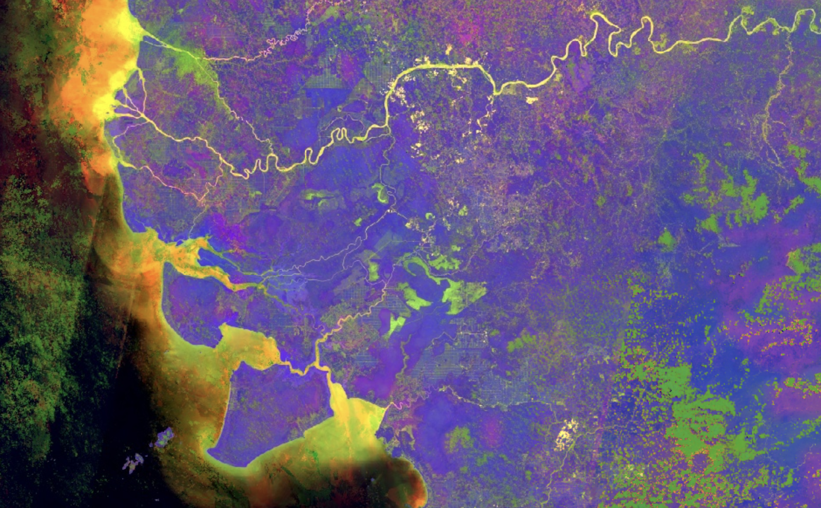
In this example, ferric iron oxides should appear yellow (a mixture of red and green), kaolinite clay should appear blue, and areas where there is both kaolinite clay and ferric iron oxides should appear white.
- Ferric iron oxides ratio 1 (4/2) → Red
- Ferric iron oxides ratio 2 (4/3) → Green
- Clay (including kaolinite) band ratio (6/7) → Blue
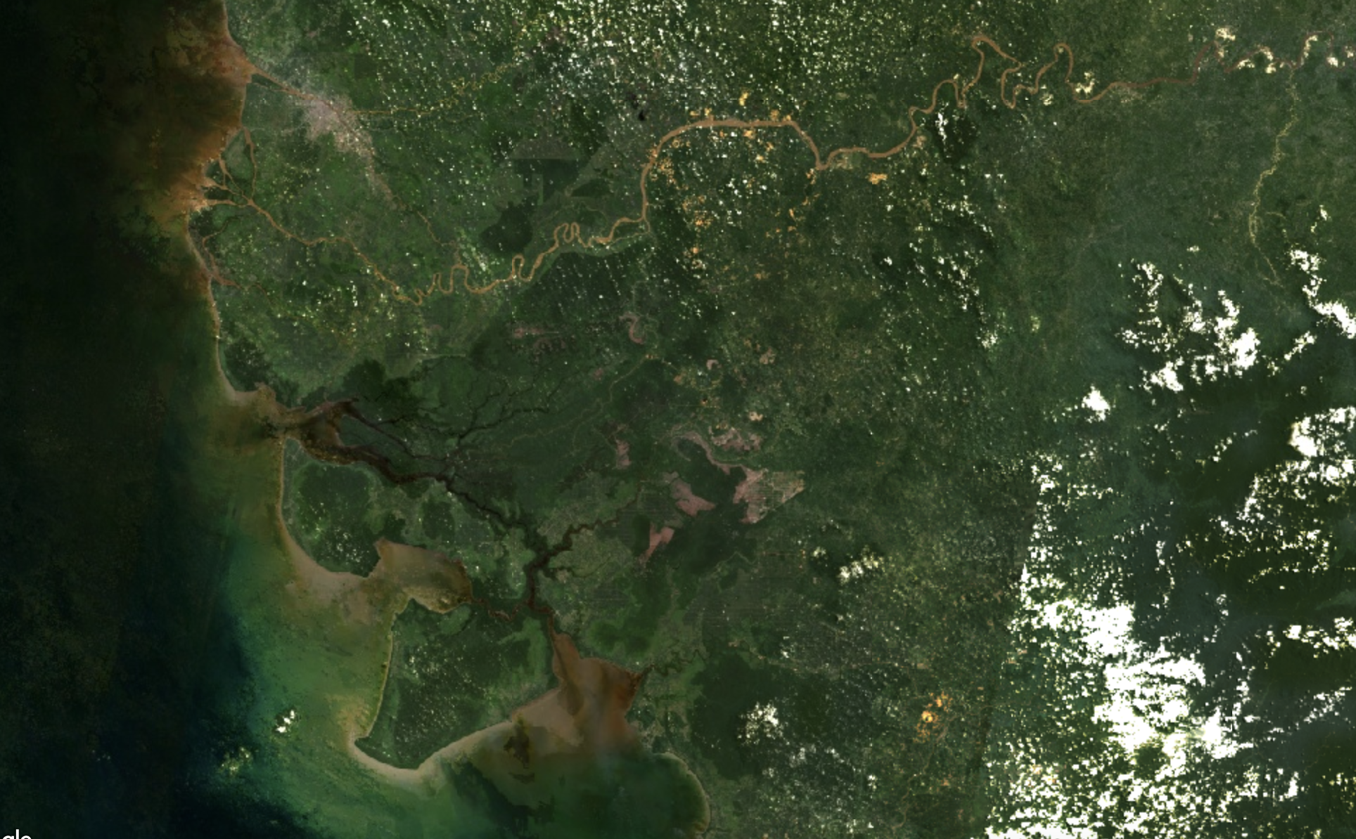
If we compare an RGB image of the region to one with the three-part ferric iron oxides/kaolinite combination, we can much more clearly see areas with potential bauxite mines highlighted in bright yellow. There are also visible spots of yellow where the river meets the sea, indicating possible traces of water pollution from these mines.
We can also compare multiple false colour images taken over time to visualise the effects of policy changes on the region.
If we take a timelapse of an area around the Kapuas river (the area in the above image with a concentration of yellow areas) between 2013 and 2024, we can see that there was barely any expansion of the yellow spots indicating possible bauxite mines between 2014 and 2018. This coincides with a 2014 ban by the Indonesian government on certain raw materials including bauxite. However, the yellow spots continue to expand again from 2018, after the Indonesian government relaxed the export ban on bauxite in 2017.
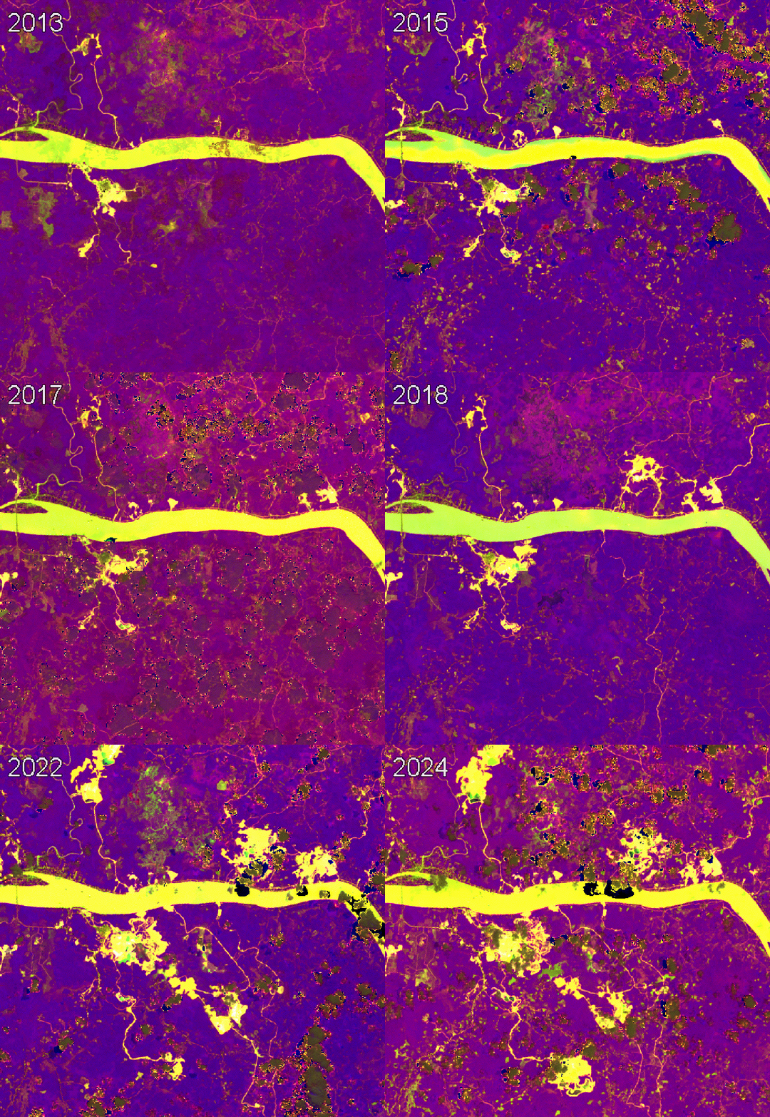
This timelapse mirrors the USGS mineral commodity summaries figures for Indonesia’s bauxite production during that timeframe: a significant drop following the export ban in 2014, followed by an increase from 2018.
3. Band Indices and the NDVI
An extension of the idea of the band ratio used above is the satellite imaging index. These indices are more complex combinations of different bands, and are used extensively to track specific phenomena, such as changes in vegetation, the presence and quality of water, soil health and tree coverage.
The Index DataBase by Verena Henricht and Ktharina Bruser is a useful resource that allows you to find indices relevant to different materials. Sentinel Hub’s EO Browser also allows users to use satellite imaging indices and custom scripts to create false colour images that highlight specific materials or phenomena such as algae and wildfires.
The case study below shows how the Normalised Difference Vegetation Index (NDVI), a popular index for detecting the presence of healthy vegetation, was used to investigate the impact of the Yemeni civil war on food security in the agricultural Tihama region of the country.
Case Study: Date Palms in Yemen
In a 2020 analysis for Bellingcat, researcher Wim Zwijnenburg used the EO Browser – based mainly on satellite images collected by the European Space Agency’s Copernicus Programme – with the NDVI to visualise vegetation loss in areas known for date palm plantations.
The analysis showed that most of the vegetation loss was in the area near the sea. This provided a starting point to focus on and, with the help of other open-source and remote sensing tools, made it possible to monitor changes in vegetation for the period and explain why the conflict had led to tree-cover loss.
Practical Recommendations for Researchers
As the above case studies demonstrate, multispectral satellite imaging provides broad and varied information about the Earth’s surface, including much that is invisible to the naked eye.
These satellite images provide open source researchers with a set of lenses that let us see a landscape differently, highlighting surface changes such as the expansion of mines, the spread of pollutants, and changes to vegetation. By amplifying subtle differences in how materials reflect different types of light, we can make quite sophisticated inferences about a landscape’s ecological and geological properties.
However, it is also important to understand some of the limitations of multispectral satellite images in order to avoid misinterpreting them. Below are some tips for what to look out for.
Tip 1: Confusing Clouds
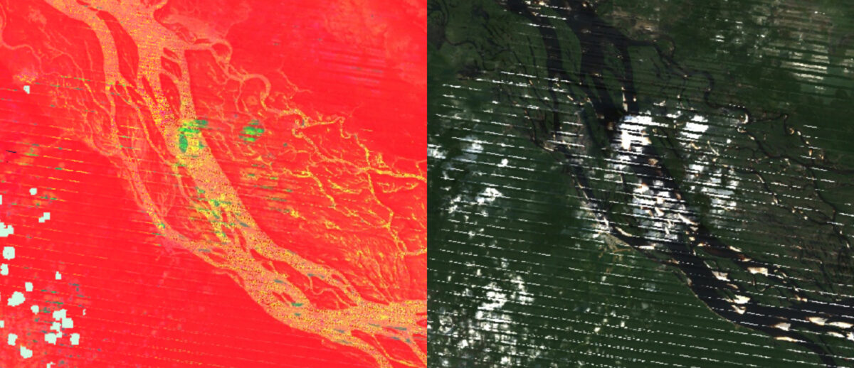
Clouds can be particularly misleading when using false colour images as they often look different from the natural landscape, and can be tricky to differentiate from other materials of interest.
Switch to the true colour image to check that what you’re seeing is of interest, and not just a cloud.
Tip 2: Hard (To Spot) Rock
Interesting features (like mining-related minerals) can be hidden by vegetation and other coverings. Areas that are covered with tree canopies are particularly prone to this. Additionally, many minerals are mined underground, rather than on the surface, making satellite imaging tools unsuitable for this analysis.
Consider these images of a bauxite mine in Kuantan, Malaysia, from the Multispectral Imagery Explorer, before and after the land in the area was covered with topsoil following the 2015-16 Kuantan Bauxite mining disaster. In the first image in 2015, the mine is clearly visible – in the second image of the same area in 2023, the mine is now hidden from view.
Tip 3: Conclude carefully
Finally, it can be tempting to draw premature conclusions about the meaning of different features on a false colour image. But in practice, geologists use a host of more complex techniques, alongside contextual surveys of the region, to draw conclusions about the mineral composition of an area. There are many materials that will look similar in false colour images, so it’s important to check with other sources of information before drawing conclusions.
For the case studies on clay and bauxite mining in this guide, we cross-referenced the false colour images against the USGS Mineral Resources map, which maps government-issued mining licenses worldwide. We also referred to a detailed interactive map of mining concessions in the region issued by the Indonesian government to confirm our observations for the case study on bauxite mining in West Kalimantan.
This guide and the Multispectral Imagery Explorer were created by Agnes Cameron as part of the Bellingcat Technical Writing Fellowship. Agnes’ full blog post includes a more detailed discussion of tools and interesting projects that use satellite imagery.
Galen Reich contributed research to this piece.
Bellingcat is a non-profit and the ability to carry out our work is dependent on the kind support of individual donors. If you would like to support our work, you can do so here. You can also subscribe to our Patreon channel here. Subscribe to our Newsletter and follow us on Bluesky here, X here and Mastodon here.
The post Seeing More With Satellite Imagery Using Band Combinations, Ratios and Indices appeared first on bellingcat.
That’s all you need to know. If you’re doing it, you’re doing it right. If you have decided to reclaim ownership of your place on the web, you’re doing it right. It doesn’t matter how you did it. It doesn’t matter if you’re self-hosting or using a SAAS. It doesn’t matter if your content lives on a database or in a TXT file. It doesn’t matter if you did everything yourself or you paid someone to do it for you. It doesn’t matter if you post once a day or once a year. What matters is that you’re doing it. Your effort is commendable. You deserve to be thanked so, thank you.
Thank you for keeping RSS alive. You're awesome.
Email me :: Sign my guestbook :: Support for 1$/month :: See my generous supporters :: Subscribe to People and Blogs
Micro.one was effectively a soft-launch yesterday, haven’t officially announced it yet. I learned a few things. Making some tweaks today. Dialing back the custom themes support so that remains a unique part of Micro.blog.
Today, most of the major streaming media platforms utilize the TPM to decrypt media streams, forcefully placing the decryption out of the user's control(from here).
This is part of an overall argument that Microsoft's insistence that only hardware with a TPM can run Windows 11 is with the goal of aiding streaming companies in their attempt to ensure media can only be played in tightly constrained environments.
I'm going to be honest here and say that I don't know what Microsoft's actual motivation for requiring a TPM in Windows 11 is. I've been talking about TPM stuff for a long time. My job involves writing a lot of TPM code. I think having a TPM enables a number of worthwhile security features. Given the choice, I'd certainly pick a computer with a TPM. But in terms of whether it's of sufficient value to lock out Windows 11 on hardware with no TPM that would otherwise be able to run it? I'm not sure that's a worthwhile tradeoff.
What I can say is that the FSF's claim is just 100% wrong, and since this seems to be the sole basis of their overall claim about Microsoft's strategy here, the argument is pretty significantly undermined. I'm not aware of any streaming media platforms making use of TPMs in any way whatsoever. There is hardware DRM that the media companies use to restrict users, but it's not in the TPM - it's in the GPU.
Let's back up for a moment. There's multiple different DRM implementations, but the big three are Widevine (owned by Google, used on Android, Chromebooks, and some other embedded devices), Fairplay (Apple implementation, used for Mac and iOS), and Playready (Microsoft's implementation, used in Windows and some other hardware streaming devices and TVs). These generally implement several levels of functionality, depending on the capabilities of the device they're running on - this will range from all the DRM functionality being implemented in software up to the hardware path that will be discussed shortly. Streaming providers can choose what level of functionality and quality to provide based on the level implemented on the client device, and it's common for 4K and HDR content to be tied to hardware DRM. In any scenario, they stream encrypted content to the client and the DRM stack decrypts it before the compressed data can be decoded and played.
The "problem" with software DRM implementations is that the decrypted material is going to exist somewhere the OS can get at it at some point, making it possible for users to simply grab the decrypted stream, somewhat defeating the entire point. Vendors try to make this difficult by obfuscating their code as much as possible (and in some cases putting some of it in-kernel), but pretty much all software DRM is at least somewhat broken and copies of any new streaming media end up being available via Bittorrent pretty quickly after release. This is why higher quality media tends to be restricted to clients that implement hardware-based DRM.
The implementation of hardware-based DRM varies. On devices in the ARM world this is usually handled by performing the cryptography in a Trusted Execution Environment, or TEE. A TEE is an area where code can be executed without the OS having any insight into it at all, with ARM's TrustZone being an example of this. By putting the DRM code in TrustZone, the cryptography can be performed in RAM that the OS has no access to, making the scraping described earlier impossible. x86 has no well-specified TEE (Intel's SGX is an example, but is no longer implemented in consumer parts), so instead this tends to be handed off to the GPU. The exact details of this implementation are somewhat opaque - of the previously mentioned DRM implementations, only Playready does hardware DRM on x86, and I haven't found any public documentation of what drivers need to expose for this to work.
In any case, as part of the DRM handshake between the client and the streaming platform, encryption keys are negotiated with the key material being stored in the GPU or the TEE, inaccessible from the OS. Once decrypted, the material is decoded (again either on the GPU or in the TEE - even in implementations that use the TEE for the cryptography, the actual media decoding may happen on the GPU) and displayed. One key point is that the decoded video material is still stored in RAM that the OS has no access to, and the GPU composites it onto the outbound video stream (which is why if you take a screenshot of a browser playing a stream using hardware-based DRM you'll just see a black window - as far as the OS can see, there is only a black window there).
Now, TPMs are sometimes referred to as a TEE, and in a way they are. However, they're fixed function - you can't run arbitrary code on the TPM, you only have whatever functionality it provides. But TPMs do have the ability to decrypt data using keys that are tied to the TPM, so isn't this sufficient? Well, no. First, the TPM can't communicate with the GPU. The OS could push encrypted material to it, and it would get plaintext material back. But the entire point of this exercise was to avoid the decrypted version of the stream from ever being visible to the OS, so this would be pointless. And rather more fundamentally, TPMs are slow. I don't think there's a TPM on the market that could decrypt a 1080p stream in realtime, let alone a 4K one.
The FSF's focus on TPMs here is not only technically wrong, it's indicative of a failure to understand what's actually happening in the industry. While the FSF has been focusing on TPMs, GPU vendors have quietly deployed all of this technology without the FSF complaining at all. Microsoft has enthusiastically participated in making hardware DRM on Windows possible, and user freedoms have suffered as a result, but Playready hardware-based DRM works just fine on hardware that doesn't have a TPM and will continue to do so.
